Analyzing Data
Analysis
Congratulations! You now have a trained model to analyze.
- Click on the “Analysis” tab, and then “Run Analysis”.
- Choose an experiment name.
- Choose the temperature and number of scenarios to run. For the first run, the defaults should be sufficient.
- Choose the data source. You can use the same data source you used to train a model, or a new data source.
- (Optional) Add a SQL query to the data source to analyze a subset of the data source.
- Choose whether the analysis you want to run is a regression or classification problem. For more details, see below.
- Choose a model that has been trained on data of the same shape.
- Click “Run”.
Amorphous will generate hundreds of what-if scenarios to run against your trained model. Once this process is complete, a new experiment will appear on the Analysis screen (you may need to refresh the page).
Regression vs Classification
Regression analysis predicts continuous numerical values, while classification predicts a specific category or label. Regression analysis is useful for predicting a range of values such as “bookings” or “usage” while classification is useful in predicting whether or not a customer will churn.
For both regression and classification, Amorphous uses the same general techniques (gradient-boosted decision trees). With classification, Amorphous will predict the probability a set of inputs will have a given label, as opposed to giving a discrete label. For example, instead of predicting whether or not a customer will churn, Amorphous will output a probability instead.
Experiments
An experiment is a complete set of what-if scenarios run by Amorphous against a trained model. In artificial intelligence parlance, this is “inference”. When an experiment is run, Amorphous uses the temperature and scenarios parameters specified in the configuration file to generate dozens or hundreds of different scenarios. In each scenario, one or more of the independent variables is modulated, and the impact on the target variable is measured.
Each experiment in the experiments section contains the predictions & analysis for a given data set. By clicking on “Analysis”, you can see a summary analysis of the results of the experiment.
What-If
The what-if section displays the results of all of the scenarios and their impact on your target variable. By clicking on each of the independent variables in the legend, you can add or remove the data from the chart. The chart is divided into four quadrants:
- The red quadrant (upper left) represents independent variables that, when decreased, ultimately increase the target variable
- The blue quadrant (upper right) represents independent variables that, when increased, also increase the target variable
- The yellow quadrant (lower left) represents independent variables that, when decreased, ultimately decrease the target variable
- Tye green quadrant (lower right) representes independent variables that, when increased, also decrease the target variable
Here is a sample chart output based on the sample churn dataset:
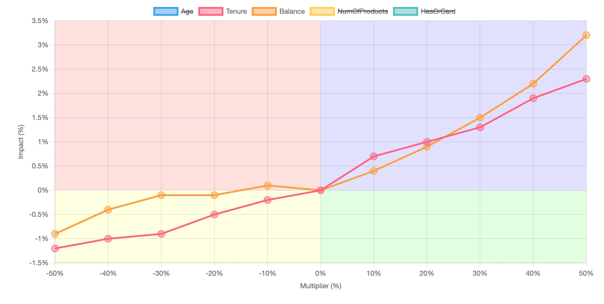
In this example, increasing both tenure and credit card balance will increase the probability of churn.
Shapley values
Shapley values are a concept from cooperative game theory that has found applications in machine learning. They offer a way to fairly distribute the “payout” or “credit” of a prediction among the input features (or “players” in the game) based on their individual contributions to the prediction. In essence, Shapley values provide a method to understand the importance of each feature in a model’s prediction by considering all possible combinations of features and their contributions, thereby offering insights into how the model makes decisions. This approach is particularly useful for explaining complex machine learning models to non-experts, as it provides a clear and intuitive way to understand the role of each input feature in the model’s output. In Amorphous, Shapley values are computed for each row of the data supplied. These values are then used to illuminate other aspects of the model.
Feature Importance
Understanding which features drive the predicted target is important. By averaging the Shapley values for all the predictions, Amorphous displays a global feature importance plot:
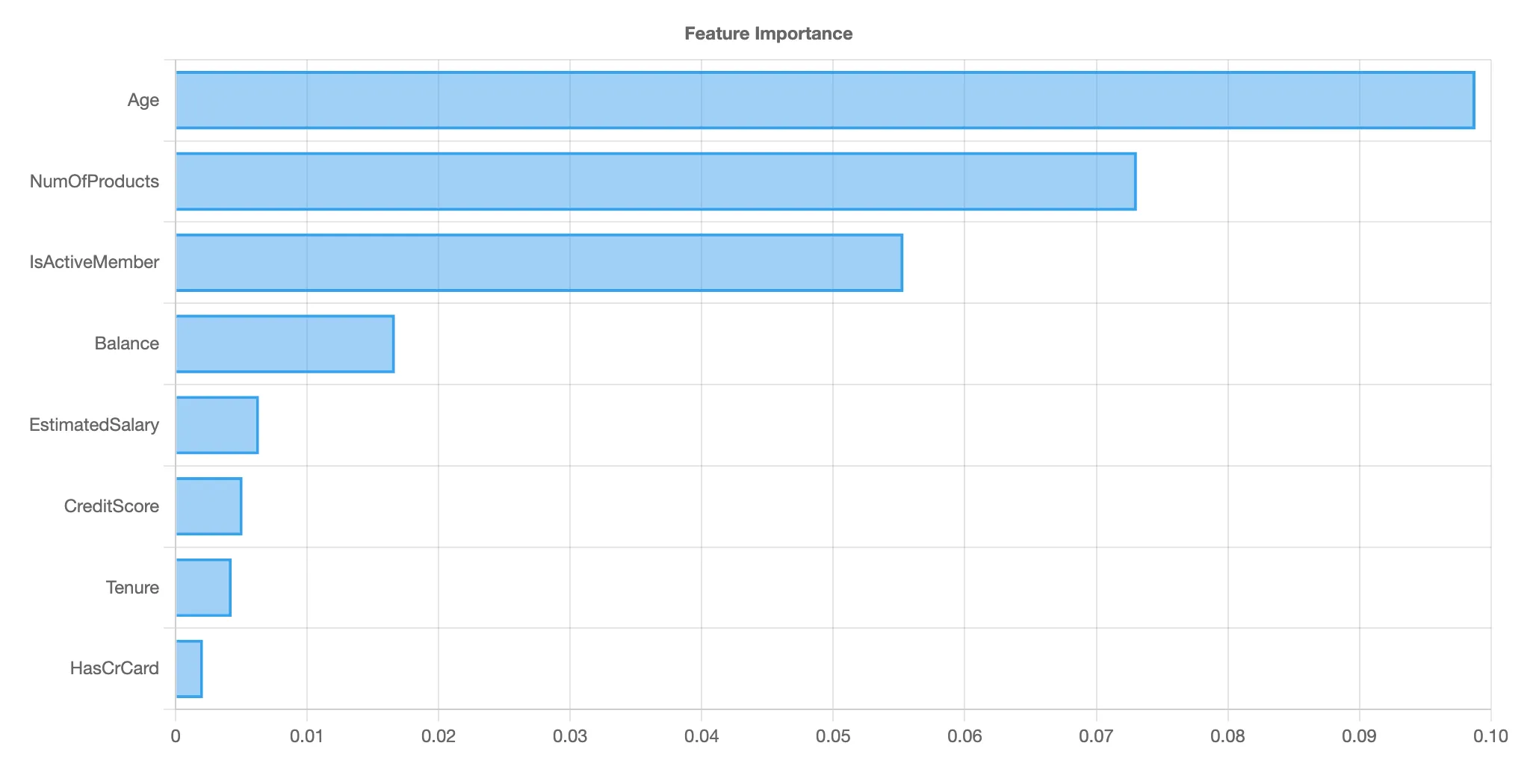
Note that the feature importance chart is different from standard machine learning (non-Shapley) feature importance charts. Traditional feature importance measures the importance of each feature to the ultimate accuracy of a prediction, but not how the feature drives the predicted value. Thus, a feature that might drive a high degree of accuracy in a model could have a low Shapley value if its presence or absence does not significantly change the prediction when considered alongside other features. This distinction is crucial for understanding not just which features are important overall, but also how each feature contributes to individual predictions.
Trends and scatter plots
Trends and scatter plots give further insight into a specific feature. The trend chart, shown on the left, shows a simple moving average of the given feature over the course of the dataset. This helps you understand at a glance the overall trend line of the data. On the right is the Shapley scatter chart. Each point represents In this chart, each dot represents a single prediction from the data set. The x-axis is the specific value of the independent variable, while the y-axis is the change in the target for a given x-axis value. These charts also help identify situations where independent variables are not completely independent. When the predicted values on the y-axis have a wide dispersion for the same x-axis value, that suggests that there are other factors in play besides the independent variable in play. Similarly, if there is a narrow dispersion, this suggests the independent variable is driving the given prediction.
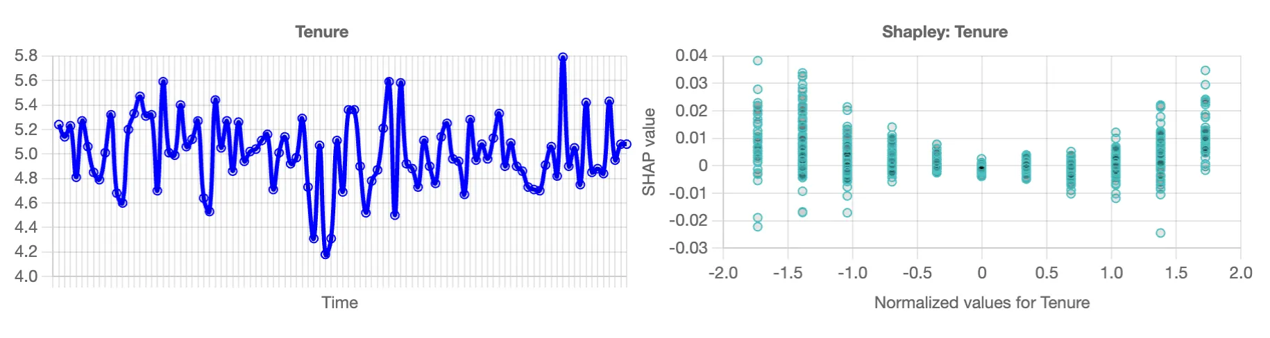
In the example chart shown here, tenure is an integer. On the left, you can see that there is no true pattern to tenure in this data set. On the right, you can see a wide vertical dispersion for each year of tenure, suggesting that tenure is not a strong independent driver of churn.
Specific Predictions
WHen you click on the magnifying glass icon for an experiment, you get a list of the specific predictions for each row of data. Each prediction also gives the rationale for a given row of data. These rationales are displayed as Shapley values, which compute the relative contribution of each specific variable to the overall prediction.
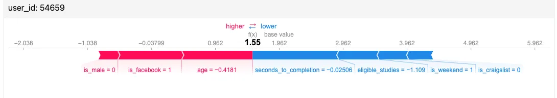
In the example above for user_id 54659, is_male, is_facebook, and age are driving the predicted value higher, whiile seconds_to_completion, eligible_studies, is_weekend, and is_craigslist are driving this value lower. The longer the bar, the bigger the impact.
Download
You can download the detailed predictions (predictions.csv) and analysis (influence.csv) as two different CSV files.
The influence.csv file has four columns:
- The first column represents the scenario. Each scenario has the name of the independent variable, followed by a multiplicative factor. For example, a multiplicative factor of
1.6signals a 60% increase in the given variable. Note that for non-scalar variables (e.g., booleans, categorical variables), the 1.6 multiplier adjusts the mix of variables, up to a maximum of 100%. - The second column is the relative efficiency score. This score is normalized between -100 and 100, and shows how much “bang for the buck” each of these scenarios offers. For example, a scenario that scores 80 means it’s relatively efficient at increasing your target value. A score that shows a -10 shows that it’s relatively inefficient at decreasing your target value.
- The third column is the actual aggregate target value.
- The final column is the percent change from the baseline forecast of the target value.
Walk-through
Let’s walk through how this would work with the Customer Data example. Once you’ve trained a model on a historical data set, you download your last six months of customer data. Because it’s current, you don’t know what your fwd_12_bookings number is for each customer in your current data set. Amorphous will read in the current data in your data file and calculate what the fwd_12_bookings should be, which you can download in the predictions.csv file.
Amorphous will also modulate the different independent variables: tickets_opened, logins, emails_received, etc to identify which variables have the highest impact on bookings. While some of the correlations may be intuitively obvious (e.g., total_usage correlates with bookings), Amorphous can also discover less obvious linkages. For example, perhaps the time_to_activation variable is highly predictive, which suggests investing in improving activation will not just impact funnel conversion, but also total bookings.
Finally, Amorphous will give the rationale for its prediction on a per-customer basis, which can be used by a customer success team to have more focused engagement with end customers.
Support
Thanks for trying Amorphous Data. We’re looking forward to your feedback. If you have questions, email info@amorphousdata.com. We also can set up a shared Slack channel for support.